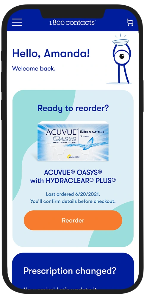
1-800 Contacts earns a significant portion of their revenue from repeat customers, but the online experience was never built with them in mind. Prescription data was stored in their accounts, a major reason they came back, yet every session dropped them into a first-time buyer flow, with friction and confusion instead of the streamlined experience they deserved. I set out to fix that by designing a dashboard that would turn reordering contact lenses into a fast, one-click process.
The problem
Repeat customers had to navigate an order flow built for first-time buyers. There was no easy access to existing prescriptions, previous orders, or account information.
When a returning customer signed in, they were dropped straight into a new customer order flow with no context. This created duplicate accounts, drove up service calls, lowered conversion rates, and caused widespread confusion.
In user sessions, we watched customers log in and wander through account pages trying to find what they needed, usually a way to update their prescription or reorder their last purchase. Call center agents confirmed the same thing: customers were calling in confused about how to place a reorder.
The existing experience auto-loaded a pre-filled cart after login with no explanation. It was disorienting, confusing, and wasn't converting well. Customers who did manage to order had to fight through the experience to get there.
My proposed solution
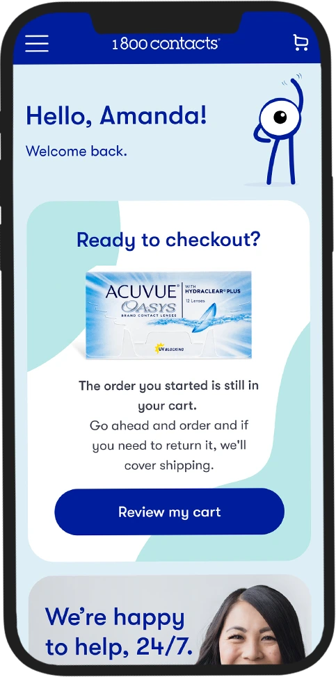
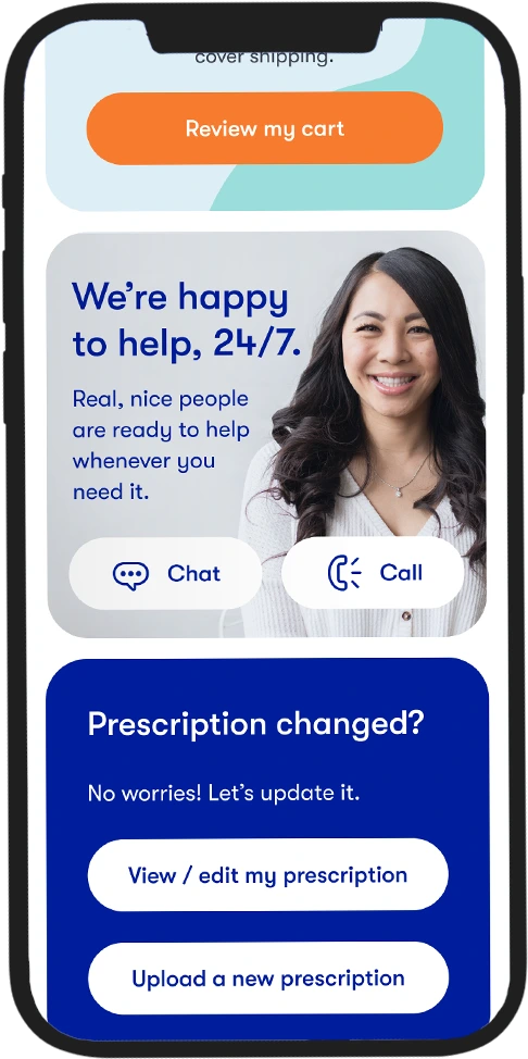
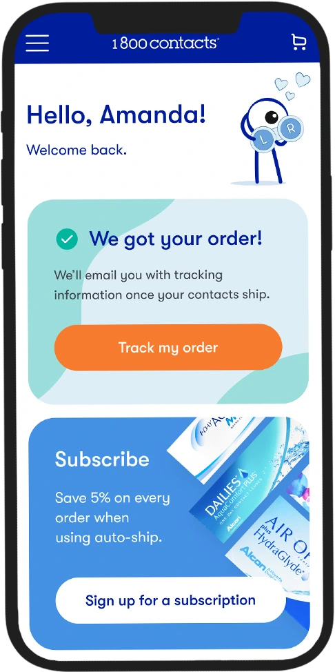
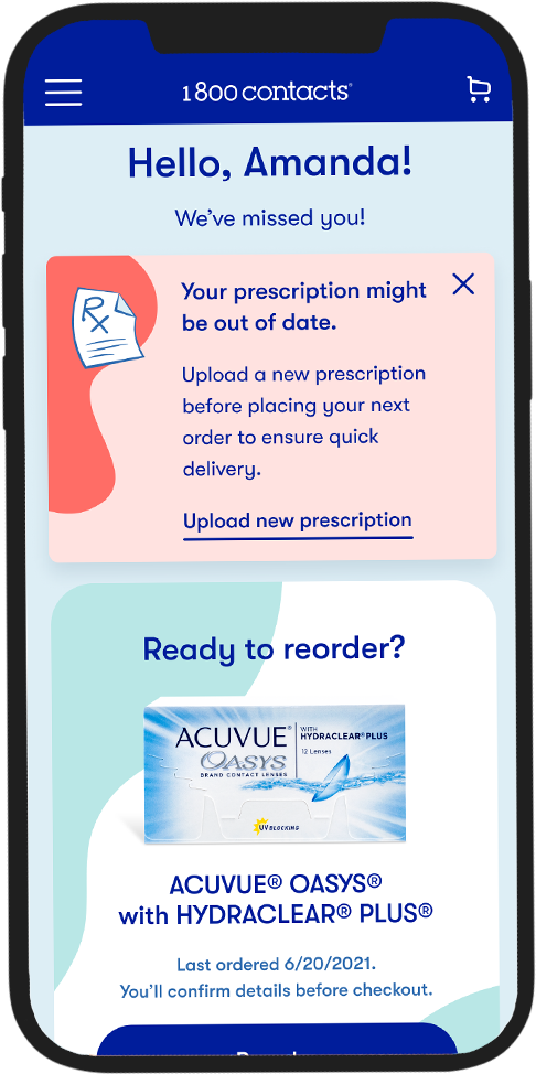
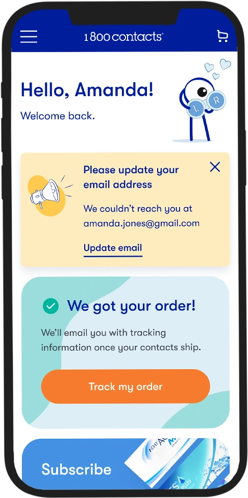
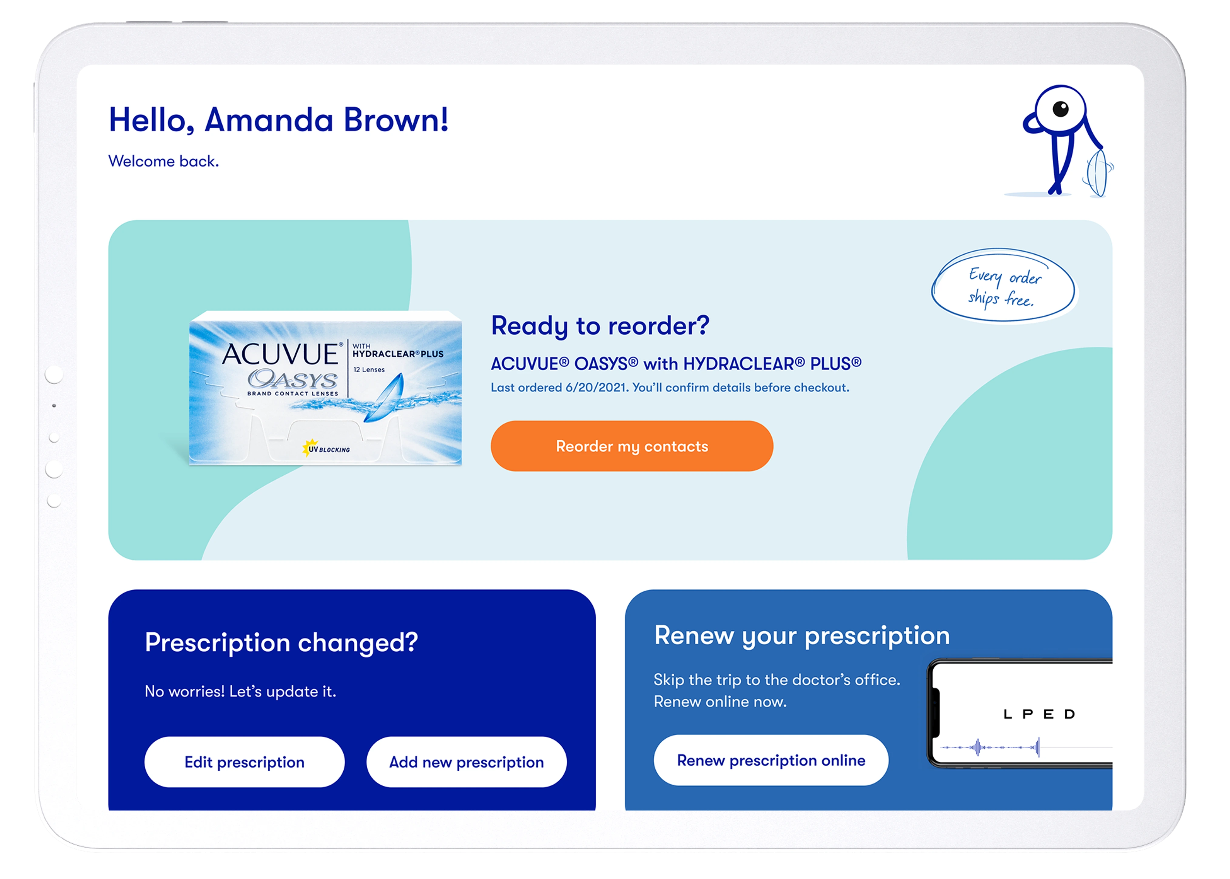
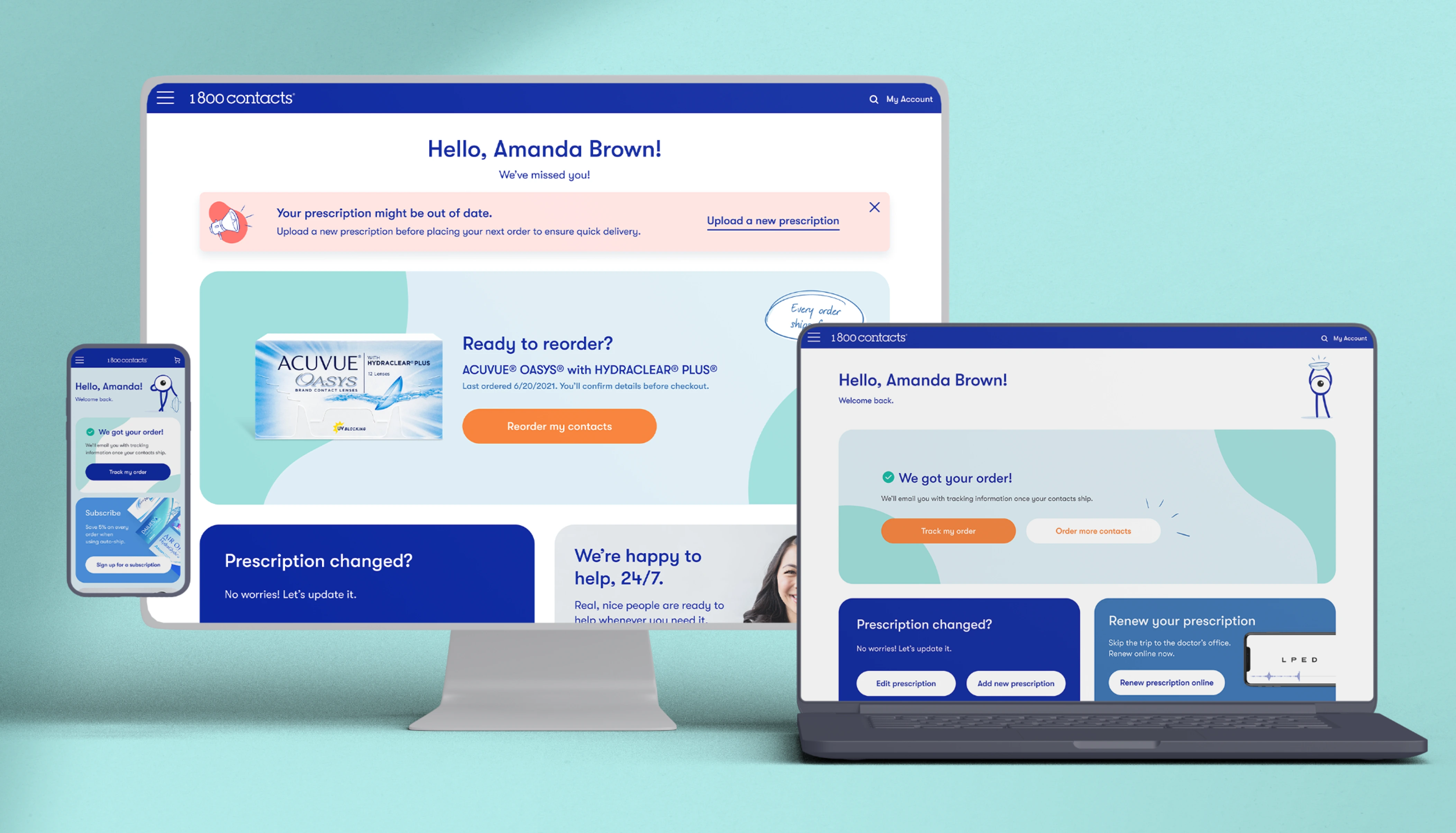
A Return Customer Dashboard that gives returning customers a smooth reorder flow and easy access to their prescription and account information.
I designed a personalized experience using existing customer data to anticipate what each person was most likely looking for and surface it immediately. The architecture supported alerts, flexible slots for personalized components from our customer data platform, and space for promotional messaging. I also carved out a spot for a bit of personality with the brand mascot, Seemore the Eye Guy.